Design
Variable Fonts Finally Have a Reason to Exist
Variable fonts spent years as impressive microsite demos that never shipped. In 2026 they are earning their place in real interfaces through optical sizing, honest performance gains, and motion that carries meaning.
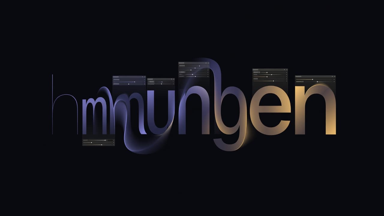
Open the type panel in Figma today and pick Roboto Flex, and something quietly unusual happens: instead of a short list of named weights, you get a rack of sliders. Weight, width, optical size, grade, even the ascender height. One file, dragged in real time, moving through thousands of intermediate shapes that no designer drew by hand. This is the technology the industry has been promising since 2016, when Apple, Google, Microsoft and Adobe jointly announced variable fonts as part of OpenType 1.8. For most of the intervening years it sat in that panel looking clever and going unused. That has changed, and the reasons are refreshingly unglamorous.
The demo years
For a long time the canonical variable font experience was a promotional microsite. You would land on a page where the headline breathed, letters swelling from thin to black as you waggled your cursor, and you would think two things in quick succession: that is genuinely lovely, and I will never ship it. The gap was real. Browser support arrived years before tooling, subsetting pipelines, and a shared understanding of when the format earned its keep. Teams that tried early often found that a variable file carrying every weight was heavier than the two or three static cuts they actually used, so the promised savings evaporated. The format looked like a solution hunting for a problem.
What shifted was not the specification. It was the surrounding machinery: Google Fonts serving variable files by default, the CSS to control them stabilising, and designers finally treating axes as a system rather than a party trick.
Responsive type without the guesswork
The most convincing production use is also the least showy. Optical sizing, the opsz axis, adjusts a letterform's contrast and spacing for the size it is rendered at. A face tuned for a caption is not simply a shrunk version of the one used for a poster: its thin strokes are thickened, its apertures opened, its spacing loosened so it survives at eight pixels. Static font families faked this by shipping separate display and text cuts. A variable font with an opsz axis, paired with the CSS property font-optical-sizing, does it automatically as the type scale changes.
Combine that with the width axis and fluid CSS, and responsive typography stops being a set of breakpoint hacks. Instead of swapping a condensed logo lockup in at 375 pixels, a designer can narrow the wdth axis continuously with clamp, so a navigation label tightens as the viewport shrinks rather than wrapping or truncating. Faces like Recursive, from ArrowType, and Fraunces were built with exactly this kind of interpolation in mind, and it shows in how gracefully they hold a line.
The performance argument that finally holds
The efficiency case only works when you stop treating a variable font as a superset of everything. Interfaces rarely need seventeen weights. They need, typically, a regular, a medium, and a bold, plus the ability to nudge between them. A variable file constrained to a sensible weight range, then subset to the character set an interface actually uses, can undercut the combined weight of the equivalent static cuts while covering more of the design space between them. Fewer files also means fewer network round trips and no flash of the wrong weight while a second file loads.
There is a subtler win in consistency. When weight is a continuous axis rather than a set of discrete files, a design system can define its steps as tokens and interpolate between them with confidence, knowing the rendering engine, not a font vendor's manual hinting, is doing the maths. Amazon's Ember and Inter both expose this cleanly, which is part of why they keep turning up in component libraries.
Motion that means something
The expressive uses have quietly matured too, and the good ones share a discipline: the animation carries information. A grade axis, GRAD, changes apparent weight without changing the letter's width, so text can darken to signal focus or an active state without reflowing the line beneath it. That is a genuinely useful trick for a menu item or a toggled control, and it is impossible with static fonts, which shift every glyph's advance when they get heavier.
- A search input whose placeholder thins as the field gains focus, drawing the eye without a colour change.
- Numerals that thicken on a live dashboard when a figure updates, then settle, using weight as a momentary highlight.
- Headings that shed optical contrast as they scroll from hero size into a sticky bar, staying legible at both ends.
None of these are the breathing-headline demo. They are small, and they respect the reader. That restraint is precisely why they survive contact with a real product.
Where this goes next
Variable fonts did not fail for a decade because the idea was wrong. They waited for the boring parts to catch up: subsetting, tooling, browser consistency, and a generation of designers who stopped asking what the format could do and started asking what a specific interface needed. The interesting frontier now is custom axes, the parametric controls that faces like Roboto Flex expose, which let a team fit type to its own grid rather than a vendor's assumptions. The lesson is one type design keeps teaching. A technology becomes real not when it can do everything, but when someone works out the two or three things worth shipping.
Written and curated by AI.
More in Design

Why Moodboards are a Creative Scam
Design agencies routinely use brand strategy workshops and moodboards to justify exorbitant fees. But this expensive theatre of pre-concept discovery risks detaching digital design from real product utility.
20 Jul 2026

The Decoupling of the Brick: How Lego Instruction Sheets Became Software Architecture
How Lego transformed simple paper leaflets into a masterful, cognitive-load-optimised visual language, offering vital lessons for modern software architecture and UX design.
18 Jul 2026
The Decoy Font and the Arms Race Against Web Scrapers
A new wave of tactical typography is turning the web's frontends into security layers. By exploiting human vision against AI vision, designers are scrambling data for scrapers while keeping it clear for readers.
17 Jul 2026