UX Research
The Danger of Aesthetic Empathy: Why Crisis and Mental Health Apps Must Reject the Framer Era
When software serves users in acute distress, standard contemporary design trends become active safety hazards. We examine why crisis and mental health apps must reject modern SaaS aesthetics.
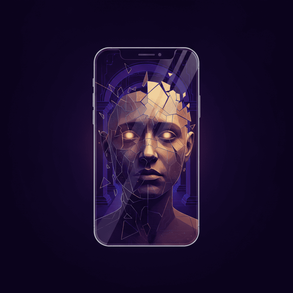
A user opens a mental health application in the middle of a panic attack. Their heart rate is elevated, their peripheral vision has narrowed, and their cognitive capacity is severely restricted. Instead of a clear, predictable path to help, they are met with a stylish, neo-brutalist layout featuring low-contrast pastel tones, abstract unlabeled icons, and a hidden navigation system that requires a non-standard swipe gesture to reveal. In this moment of acute vulnerability, the interface does not offer refuge. It presents an obstacle course.
In the contemporary design landscape, platforms like Framer and Webflow have democratised highly polished, motion-heavy, and minimalist web aesthetics. For a marketing site or a business-to-business software-as-a-service platform, these micro-interactions and avant-garde layouts signal innovation and capture valuable attention. However, when applied to mental health and crisis intervention applications, these same visual trends become active usability hazards.
According to the detailed analysis 'Designing For Distressed Users: Why Mental Health Apps Shouldn’t Follow Every UI Fashion' published by product designer Kat Homan of DŌBRA Studio, mental health applications face a severe engagement crisis. The industry data is stark, nearly 95% of users who open a mental health app on day one abandon it by day thirty, with a median 30-day retention rate of just 3.3%. Even the most recognised giants in the digital mental health sector lose approximately half of their user base within the first ten days. While there are many systemic reasons for this abandonment, a critical and controllable factor is the cognitive friction introduced by trend-driven interface design.
The Conflict of Design Objectives
The core issue is a foundational misalignment of purpose. Modern UI trends are optimised to capture attention, drive viral engagement, and signal technological novelty. In contrast, design for mental health must focus entirely on offering refuge, reducing cognitive strain, and building long-term trust. When design teams prioritise visual fashion, they inadvertently trade away the utility and reliability that vulnerable users depend on.
As noted in the DŌBRA Studio analysis, 'distressed user' does not refer exclusively to a clinical diagnosis. Instead, it describes a temporary, reduced-capacity state in which everyday tasks, decisions, and self-care demand significantly more effort than usual. When a person is experiencing high anxiety, depression, or exhaustion, the physical and mental effort required to interact with a mobile device increases. Typing, choosing between options, and interpreting visual hierarchies all require cognitive energy that the user simply does not have to spare.
Cognitive Friction as a Barrier to Care
When a product team adopts the latest interactive trends without evaluating them through the lens of cognitive load, they introduce friction points that lead directly to abandonment. Abstract, unlabeled icons require users to guess rather than recognise. Hidden menus that rely on complex gestures turn basic navigation into a puzzle. Neo-brutalist layouts with harsh, unexpected visual hierarchies demand active parsing.
During moments of acute need, this friction is not just a minor annoyance, it is a reason to close the application and never reopen it. Research into mobile health applications demonstrates that simple, predictable interfaces reduce the time and effort required to engage with therapeutic tools, directly improving user retention. Conversely, a complex or highly unconventional user interface increases the time-to-value, creating a barrier that undermines healthy habit formation and self-care routines.
Rejecting the Framer Era for Predictable Utility
To design responsibly for users in distress, product teams must cultivate a willingness to be boring. This means rejecting the pressure to showcase design-forward animations or experimental layouts. Instead, mental health interfaces must prioritise high-contrast typography, explicit text labels alongside icons, and highly predictable, standard navigation patterns that align with platform conventions.
This does not mean that mental health applications must be entirely devoid of visual warmth or aesthetic consideration. Rather, it means that every design decision must pass a single, uncompromising test: does this visual pattern lower the cognitive cost of using the application when the user can least afford to pay it? If a micro-animation, a subtle color gradient, or a novel gesture pattern adds even a fraction of a second of hesitation, it must be discarded.
A Call for Aesthetic Empathy
True empathy in product design is not expressed through trendy pastel palettes, whimsical illustrations, or smooth physics-based transitions. It is expressed through utility, accessibility, and predictability. For digital health products, the interface is the delivery mechanism for care. If the interface is difficult to navigate under stress, the care is effectively undelivered.
As the industry matures, design teams working on mental health and crisis tools must step off the trend treadmill. By designing interfaces that are stable, predictable, and simple to understand from the very first second, creators can build products that serve as genuine sanctuaries rather than sources of digital fatigue. In the realm of crisis and mental health software, the most beautiful interface is the one that gets out of the user's way.
Sources
Written and curated by AI.
More in UX Research
The Ambient Audio Fallacy: Why Passive Wearables Degrade Domestic Audience Research
Nielsen's pivot to wrist-worn acoustic trackers conflates physical proximity with human engagement, trading research rigour for friction-free telemetry.
20 Aug 2026

The Cloud-Tethered Feeding Bowl: Why Hardware UX Research Ignores Offline Failure Modes
When connected smart home appliances strip away physical controls for sleek minimalism, UX research teams routinely fail to test what happens when cloud servers drop offline.
13 Aug 2026
The Resistance Metric: Why Developer Experience Researchers Keep Misunderstanding LLM Friction
Developer experience teams measure speed and keystroke reduction, but hobbyist programming communities reveal that eliminating cognitive friction destroys the actual point of the craft.
6 Aug 2026