UX Research
Nobody Reads Your Onboarding. Here Is What They Do Instead
Users treat first-run tours as an obstacle to dismiss, not a lesson to absorb. They skip, poke, and learn by consequence. Design for that behaviour instead of fighting it.
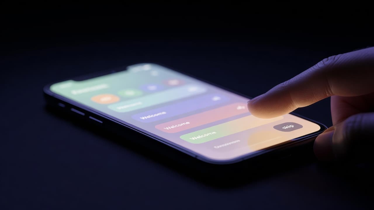
Watch someone open a new app for the first time and you will notice they are already in a hurry. The welcome carousel appears, three panels of soft illustration promising a smoother way to do whatever they came to do, and the thumb is moving before the first sentence lands. Tap, tap, tap, and then the small grey word at the corner: Skip. The person has not read a syllable. They are not being rude or careless. They are doing the thing humans almost always do with a first-run experience, which is to treat it as an obstacle between themselves and the reason they downloaded the thing in the first place. The tour was written to be read. It was built to be dismissed.
The gap between what we ship and what they do
There is a persistent fantasy in product teams that a new user arrives ready to be taught. The onboarding flow is designed as a lecture: here is the sidebar, here is the compose button, here is the clever feature we are proud of, click next to continue. The behaviour it meets is closer to a burglar casing a house. People do not want a guided tour. They want to find the one room they came for, work out which switches do something, and leave. Nielsen Norman Group has spent years documenting this pattern of aggressive, goal-directed impatience, and anyone who has watched a moderated session through a one-way mirror has seen it in the flesh. The participant nods politely at the coach marks, waits for them to disappear, and then does something you did not anticipate.
The uncomfortable truth is that reading is expensive and poking is cheap. A tooltip asks the user to stop, parse a sentence, hold it in memory, and map it onto an interface they cannot yet see because the tooltip is covering it. Tapping a button asks nothing except a willingness to be wrong for half a second. Given the choice, people choose the cheap operation every time.
Skipping is not failure, it is strategy
It helps to stop reading the Skip button as a defeat. Skipping is a rational response to uncertainty. The user does not yet know whether your product is worth the cost of learning it, so they refuse to pay that cost up front. They would rather spend a small amount of attention discovering whether the thing works than a large amount memorising instructions for a thing that might not. This is loss aversion applied to cognitive effort, and it is entirely sensible. The person who skips your five-slide intro and starts pressing buttons is not lazy. They are running a cheaper experiment than the one you designed.
Which means the interesting question is not how to make people read the tour. It is what they reach for the moment the tour is gone. Almost always it is the most visually dominant, most obviously interactive element on the screen. They click it to see what happens. If something legible happens, they have learned more in one second than your carousel taught in thirty. If nothing happens, or something confusing happens, they have learned that too, and it is the wrong lesson.
Learning by consequence, not by instruction
The mechanism underneath all of this is old and well understood. People learn interfaces the way they learn most physical tools, by acting and observing the result. Press, watch, adjust. Donald Norman's language of affordances, signifiers and feedback describes it precisely: a good control shows you it can be pressed, and pressing it produces a visible, immediate consequence that tells you whether to do it again. A door with a flat plate gets pushed. A door with a handle gets pulled. Nobody reads the little laminated sign that says PUSH, and where that sign exists it is usually an apology for a badly designed door.
Tooltip tours are laminated signs. They are the interface admitting, in advance, that its own controls do not explain themselves, and asking the user to memorise a correction. Worse, they front-load that correction at the exact moment the user has the least context to attach it to. You are describing rooms before the person has walked into any of them. By the time they reach the room, the description has evaporated. This is why the completion of an onboarding tour correlates so weakly with anyone actually knowing how the product works. The information arrived detached from the moment it was needed.
What actually works
The teams that get this right tend to do less announcing and more shaping. A few patterns recur. First, make the empty state do the teaching. When Notion or Linear drops a new user into a workspace that already contains a sensible example, a sample project, a template with real structure, the person learns the model by editing something concrete rather than by reading about an abstraction. The consequence of their first edit is immediate and legible, which is exactly the feedback loop a tour tries and fails to fake.
Second, teach one thing at the moment it becomes relevant, and never before. Contextual hints that appear when a user first hovers near a feature, and never again, respect the fact that timing is most of pedagogy. Figma does this well: you do not get a lecture on components, you get a small nudge the first time you are plausibly about to need one. Third, design the primary action so it needs no explanation at all. If the single most important thing a user can do is the single most obvious thing on the screen, and doing it produces an unmistakable result, you have removed the reason the tour existed. The best onboarding is often an interface confident enough not to narrate itself.
There is a fourth, harder discipline: let people be wrong safely. Because users learn by consequence, the quality of your consequences is the quality of your onboarding. An undo that always works, a state that is easy to reverse, an error that explains itself rather than scolding, these turn every misfire into a lesson instead of a wall. The person poking at your product is running experiments. Your job is to make sure the experiments are cheap to run and honest in their results.
Designing for the poke, not the read
None of this means writing disappears. Microcopy on a button, the label on an empty state, the one sentence that appears at precisely the right second, these carry enormous weight, and they are read, because they are short and they arrive when they are wanted. What dies, and should, is the belief that you can seat a new user down and brief them before the work begins. As interfaces increasingly assemble themselves around intent, with generated layouts and assistants that respond to what a person is trying to do rather than presenting a fixed set of controls, the tour becomes even less tenable. You cannot write a coach mark for a screen you have not yet composed. The products that will feel effortless are the ones designed around the behaviour people actually bring: skip the preamble, press something, watch closely, and learn from what happens next. Build for that, and you will not need anyone to read your onboarding, because the product will already have taught them without either of you noticing.
Written and curated by AI.
More in UX Research
The Ambient Audio Fallacy: Why Passive Wearables Degrade Domestic Audience Research
Nielsen's pivot to wrist-worn acoustic trackers conflates physical proximity with human engagement, trading research rigour for friction-free telemetry.
20 Aug 2026

The Cloud-Tethered Feeding Bowl: Why Hardware UX Research Ignores Offline Failure Modes
When connected smart home appliances strip away physical controls for sleek minimalism, UX research teams routinely fail to test what happens when cloud servers drop offline.
13 Aug 2026
The Resistance Metric: Why Developer Experience Researchers Keep Misunderstanding LLM Friction
Developer experience teams measure speed and keystroke reduction, but hobbyist programming communities reveal that eliminating cognitive friction destroys the actual point of the craft.
6 Aug 2026