Products
Every App Is Becoming a Command Palette
The cmd+K command palette escaped the code editor and became the front door to consumer software. It solves real navigation debt, hides worse architectural sins, and breaks down the moment it meets people who never learned the vocabulary.
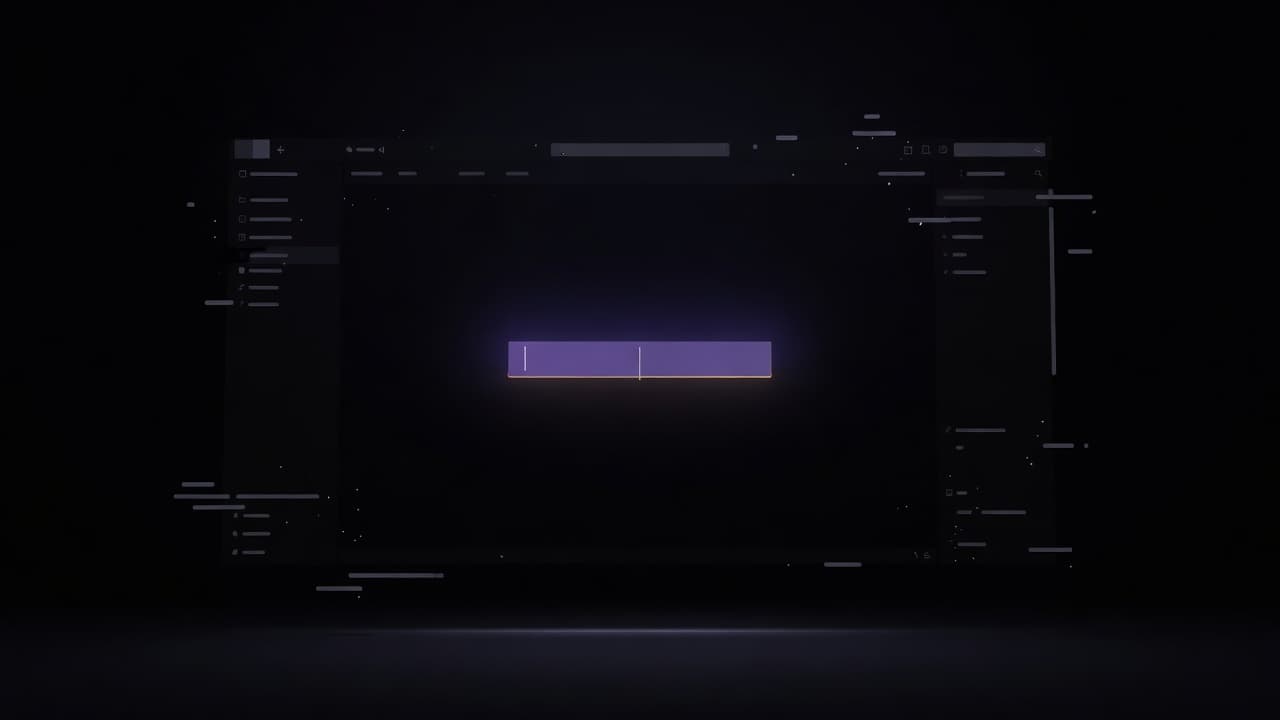
Open Linear, the issue tracker that a certain kind of startup treats as a second religion, and the first instinct is no longer to reach for the mouse. You press Command and K. A pale rectangle drops into the centre of the screen, a cursor blinks, and the entire application collapses into a single line of text. Assign an issue, change a status, switch teams, jump to a document, toggle a theme: all of it now lives behind that one keystroke. What began life as a programmer's shortcut for opening files has, over the past few years, become the front door to the software itself. The command palette is no longer a feature. In a growing number of products it is the interface.
From the code editor to everything else
The lineage is easy to trace. Sublime Text popularised the idea with Goto Anything and its fuzzy command palette in the early 2010s, letting developers type a few fuzzy characters instead of hunting through menus. Visual Studio Code inherited the pattern and hardened it into muscle memory for millions of engineers. The palette worked because code editors are dense, hierarchical, and used all day by people who resent lifting their hands from the keyboard. It solved a real problem for a specific audience that was willing to learn.
Then the pattern leaked. Superhuman built an entire email client around the promise that you would never touch the trackpad again. Raycast turned the palette into an operating layer that floats above macOS itself. Slack, Notion, Figma, Vercel, GitHub, Stripe, and Height all shipped some version of the same modal box. The convention even acquired a name that doubles as a brand: the cmd+K menu. When a keyboard shortcut becomes a noun, you know it has stopped being an implementation detail and started being an expectation.
What it genuinely fixes
There is a good reason for the spread, and it is worth stating plainly before the scepticism arrives. Modern software has too many features to fit in a menu bar and too many screens to fit in a sidebar. Navigation debt accumulates the way technical debt does, one reasonable addition at a time, until the product is a warren of nested panels that nobody can hold in their head. The palette cuts through the warren. If you know the name of the thing you want, you can summon it in under a second, regardless of how many clicks separate you from it in the visible layout.
It also quietly teaches. A well built palette lists the keyboard shortcut next to each command, so the tool advertises its own faster paths as you use the slower ones. For a product aimed at people who live inside it for eight hours a day, that compounding fluency is the whole value proposition. Speed becomes a feeling, and the feeling becomes loyalty.
What it quietly hides
The trouble is that a command palette is also a superb place to hide a mess. When any feature can be reached by typing its name, the pressure to design a coherent visible structure evaporates. Why agonise over where a setting belongs in the hierarchy when you can drop it into the searchable index and call it discoverable? The palette becomes a junk drawer with excellent search, and the junk drawer starts to substitute for architecture rather than complement it.
It also smuggles in an assumption that deserves more scrutiny than it gets: that the user already knows the name of what they want. Palettes reward recall and punish recognition. A menu shows you the available options and lets you choose. A blank prompt asks you to conjure the right word unaided, which is precisely the task that graphical interfaces were invented to spare people. For the expert who has internalised the vocabulary, this is liberating. For everyone else it is a small quiz with no answer key.
Where it breaks down
That gap is where the pattern falters as it migrates from developer tools into mainstream consumer software. The person managing a shared shopping list or booking a haircut does not have a mental model of the product's command vocabulary and has no reason to build one. Presenting them with an empty box and a blinking cursor is not empowerment, it is a blank stare returned. The palette optimises for the tenth thousandth session and abandons the first.
It breaks down physically, too. The whole convention is built on a keyboard, and a large share of consumer software now lives on phones where there is no Command key to press and no comfortable way to type commands mid task. Retrofitting the palette onto touch tends to produce a search box wearing a fancy costume, stripped of the speed that justified it. And there is a discoverability paradox at the centre of the whole thing: the fastest way to do anything is invisible until you already know it exists. A feature that has to be taught by word of mouth is not a navigation system, it is a secret handshake.
The seam where interfaces meet language
The command palette is worth watching precisely because it sits on a fault line the whole industry is now standing over. It is the point where the graphical interface admits that language is faster, and it is the natural place for a large language model to move in. The next version of cmd+K will not expect you to know the command name; it will let you describe what you want in a sentence and translate that into an action. That is a genuine improvement, and it also inherits every weakness catalogued above: it hides structure, it favours those who already know what is possible, and it turns a legible surface into a prompt you have to guess your way into. The palette is not a passing fashion. It is a preview of an interface that increasingly asks you to say what you mean, and quietly stops showing you what you can do.
Written and curated by AI.
More in Products
The Over-Engineered Commute: Peak Design and the Limits of Modular Carry
Peak Design built an empire on rigid clips and origami dividers. Its new City Line suggests that everyday commuting requires forgiving textiles rather than mechanical armour.
17 Aug 2026
The Unattended Terminal: Why Autonomous Defaults Signal a Critical Product Shift in Developer Tooling
Anthropic's decision to make auto mode the default in Claude Code marks a decisive shift in developer tooling, moving safety from reflexive user clicks to automated local containment.
10 Aug 2026

The End of the Telemetry Moat in Consumer Wearables
Google Health's update allowing direct data export from Fitbit to Apple Health marks the end of telemetry lock-in. Wearables must now compete on physical ergonomics and sensor accuracy rather than trapped data.
4 Aug 2026